E-commerce & redesign2026

La Source Vivanbois
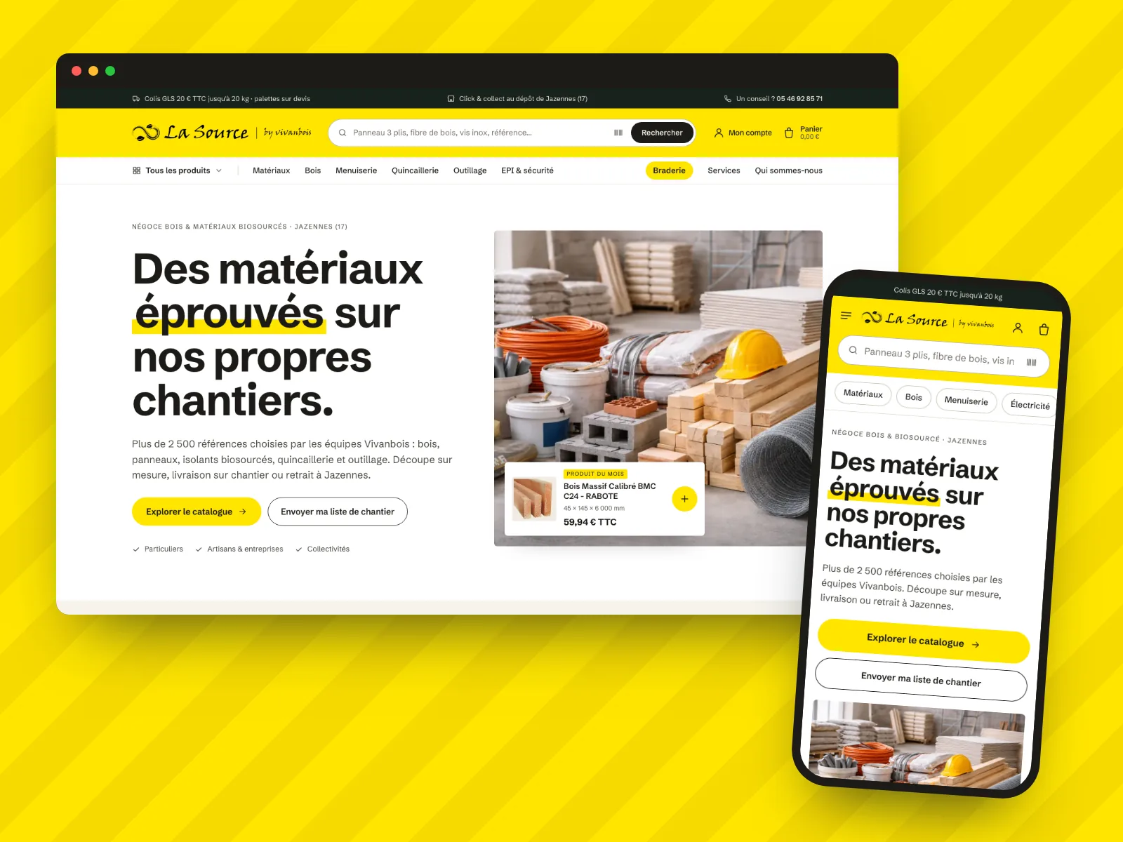
Preview of the La Source Vivanbois project

A WooCommerce store wired to the merchant’s ERP, then fully redesigned: a clear trade counter where you find the right reference and buy in the right pack size.

Context

La Source is the trade counter of Vivanbois, a construction and energy-renovation company based in Jazennes, Charente-Maritime. Its range comes from its own teams’ building sites: timber, boards, bio-based insulation, hardware, tools. The site speaks to private customers and tradespeople alike, and the whole catalogue comes from the merchant’s ERP, with labels in capitals and items sold by the piece, the box or the pack.

What I did

I first put the store online and wired its catalogue to the ERP, with an automatic import, safeguards and a merchant’s delivery rules. Then I rebuilt the whole front end: a white-background art direction, a complete design system and every page redone, from the home page to the customer account, on the same WooCommerce base and without changing a single catalogue address.

Key points

  • 11×less JavaScript per page: from 396 KB to 35 KB
  • 7 importsa day from the ERP, with safeguards
  • ≈ 3,900items, sold by the piece, the box or the m²
In-depth case study

From the Jazennes depot to the basket, step by step.

  1. 01The merchant

    A builder’s merchant

    Vivanbois is a construction and energy-renovation company. La Source is its trade counter: a depot in Jazennes where private customers, tradespeople, companies and local authorities come for timber, boards, bio-based insulation, hardware and tools.

    The range comes from the teams’ own sites: what they use, the counter sells. The website had to keep that trade-counter credibility, where people talk dimensions, pack sizes and lead times.

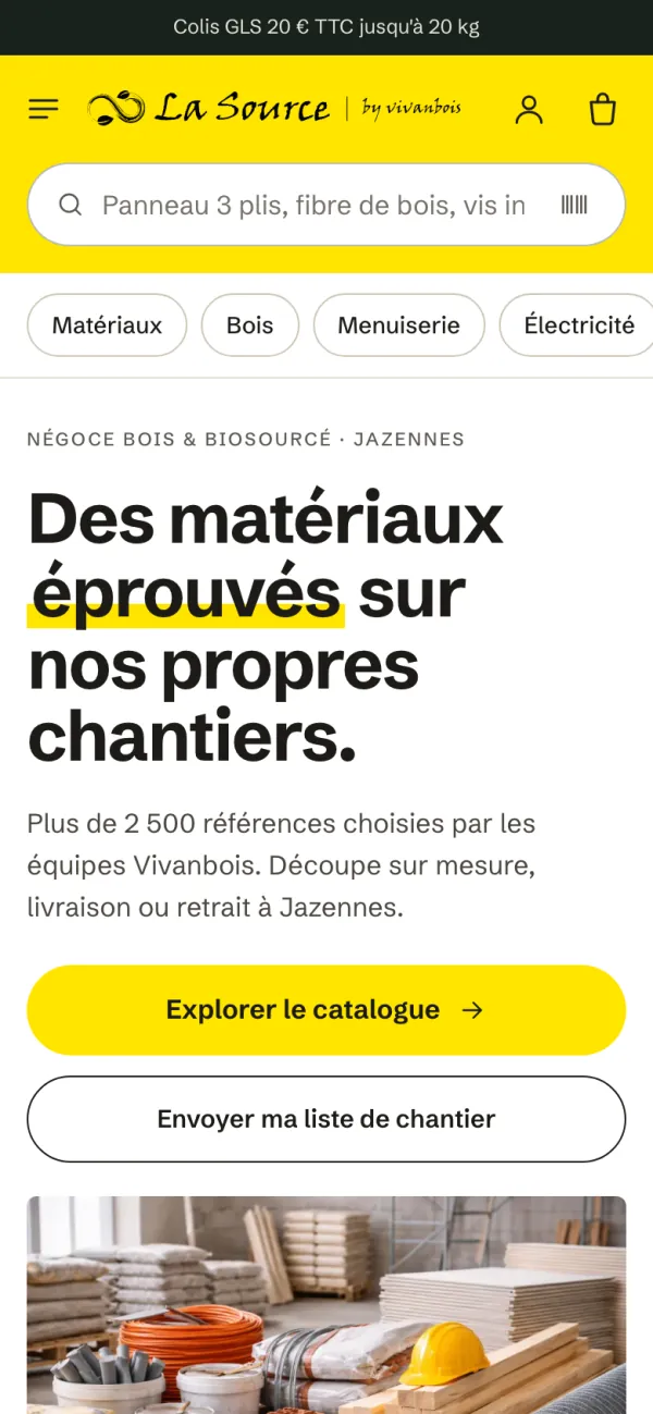
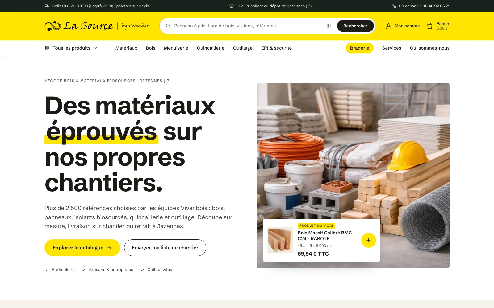
    La Source home page: the headline “Des matériaux éprouvés sur nos propres chantiers”, a photo of materials and the product of the month card.
    The home page: the merchant’s promise, and a product of the month you add to the basket without leaving the page.
  2. 02Starting point

    Keep what worked

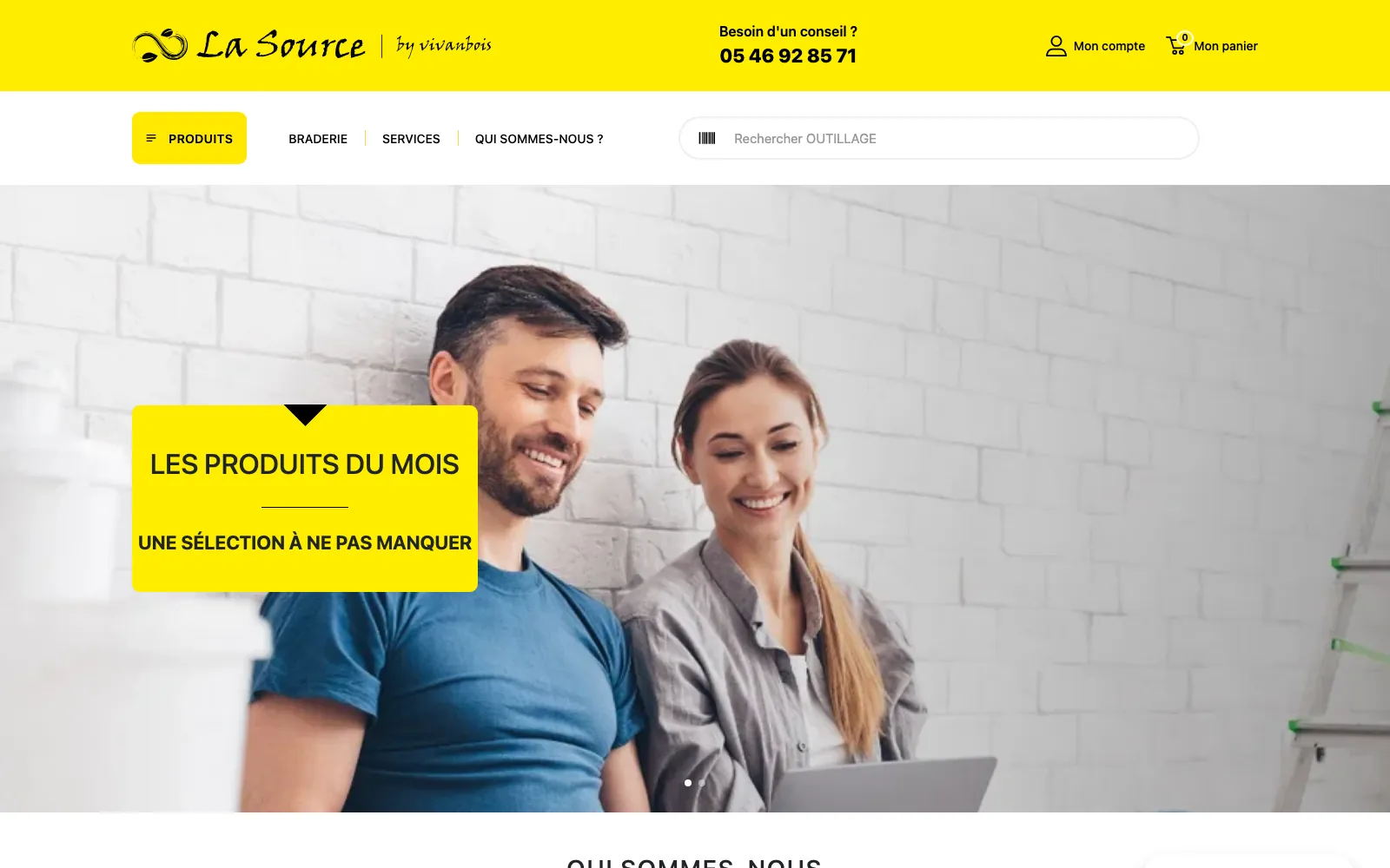
    The first version held up, but it had aged: a two-block header, a large promotional banner at the top of the home page, and a theme that loaded Bootstrap, Swiper, GSAP and external fonts on every page.

    First, I listed what must not change. The logo’s yellow, which is the brand. Product and category addresses, so nothing is lost on Google. The ERP import, customer accounts, orders and every delivery rule.

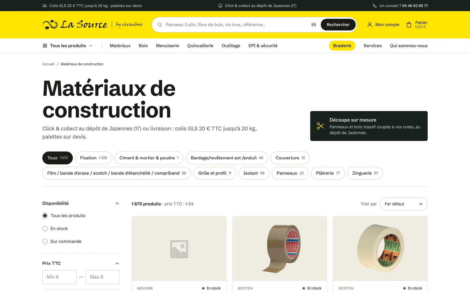
    Former home page: a yellow header, a Products button and a large promotional banner.New home page: information bar, yellow header with search, categories, large bold headline and a photo of materials.
    The home page, before and after: the same brand and the same catalogue, presented differently.
  3. 03The catalogue

    A catalogue that comes from the ERP

    Items, prices and stock levels are entered in the merchant’s ERP, which drops its exports on an FTP server. A gateway files them in object storage, and the store checks seven times a day for a new export to update its 3,900 or so items.

    An automatic import has to be able to say no. If an export arrives abnormally short, the store no longer deletes anything and alerts me. A lock stops two imports from running at once, which had created duplicates.

    On screen, the ERP labels are reformatted: “MATERIAUX DE CONSTRUCTION” becomes “Matériaux de construction”, and the categories finally read well.

    The building materials category: the title, sub-categories as pills with their product counts, filters on the left and the product grid.
    A category: sub-categories as pills, filters on the left, products on the right.
  4. 04Art direction

    A trade counter, on white

    I presented the direction as mock-ups, from the home page to the product page. The client approved it with one request: a white background rather than cream. Cream stays for flat areas and behind product photos.

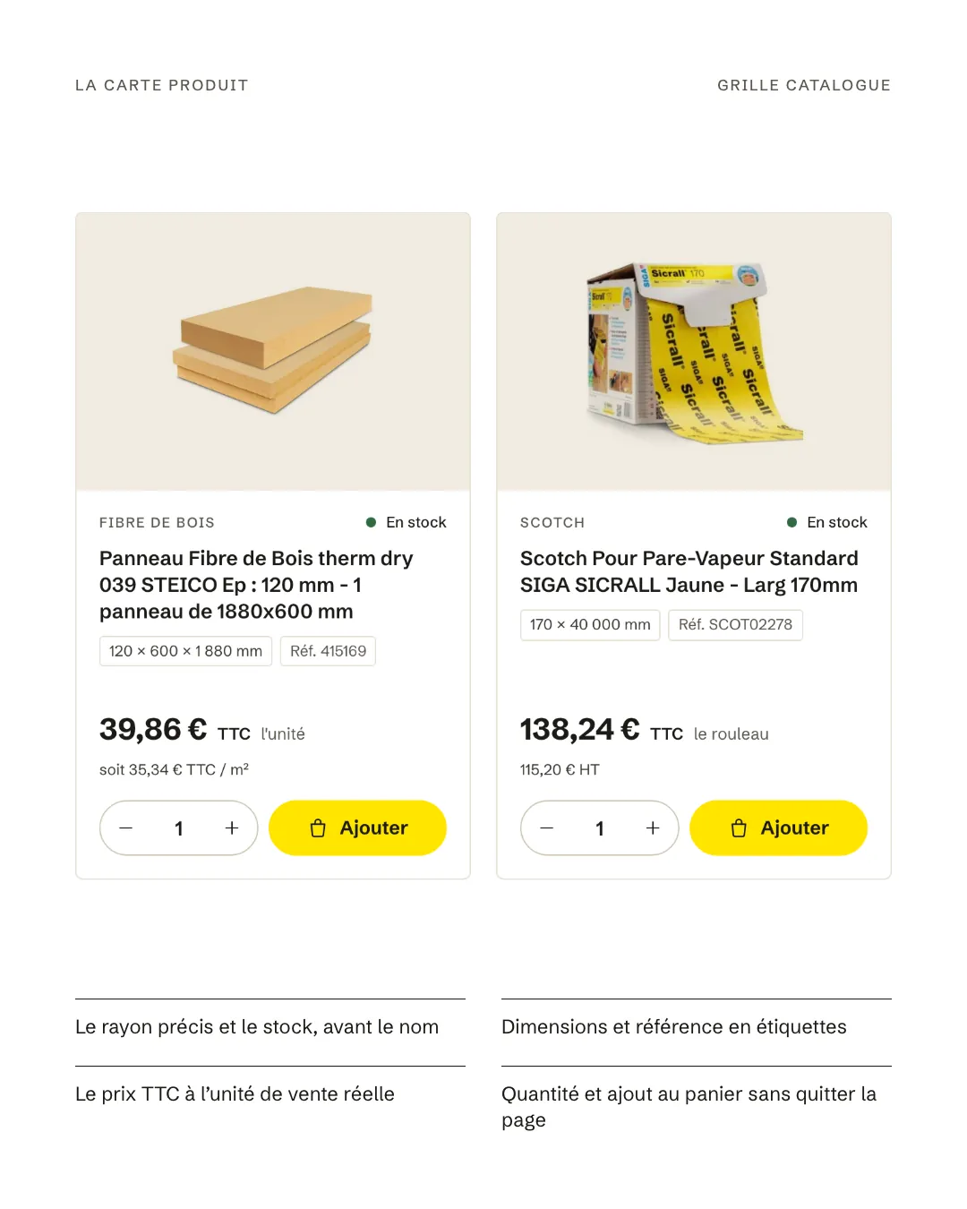
    Supplier photos nearly always have a white background. Set on this light-timber tone, they blend into the card instead of floating in white frames.

    Two product cards: the photo on a light-timber background, category and stock, the name, dimensions and reference as tags, the price including VAT per sales unit, quantity and the yellow Add button.
  5. 05Typography

    One typeface, three jobs

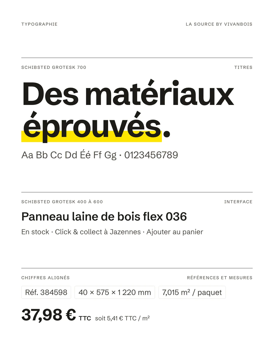
    I first paired three typefaces: a serif for headlines, a grotesque for the interface, a monospace for figures. After the first presentations, the client wanted something plainer. Schibsted Grotesk, the interface face, now carries the whole site, with headlines in bold.

    References, dimensions and prices per m² keep lining figures, all the same height, as on an order form. Each page now loads a single 46 KB font file, served by the site itself and preloaded: text shows up straight away in the right typeface.

    Type specimen in Schibsted Grotesk: “Des matériaux éprouvés” in bold, a product name, then a reference, dimensions and a price per m² in lining figures.
  6. 06Colour

    The brand yellow, where it belongs

    The yellow comes from the logo. It holds the header, the quote band and the buy buttons: on the page, it nearly always signals an action.

    A very dark forest green carries the information bar and the footer. The rest is white, with a light timber tone for flat areas and behind photos.

    • Jaune La Source#FFE500header and buy buttons
    • Vert forêt#17221Cinformation bar and footer
    • Bois clair#F1ECE2behind product photos
  7. 07Product page

    Buying in the right pack size

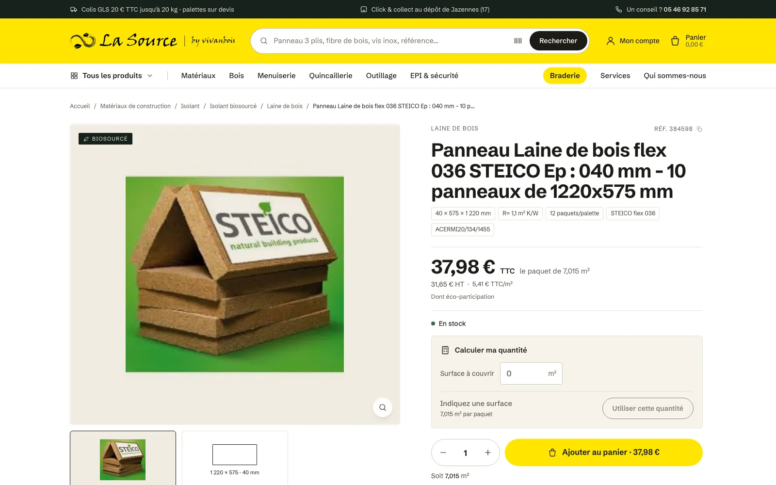
    Insulation sells by the pack, wall plugs by the box of 25, tape by the roll. So every price shows its real sales unit, including VAT then excluding VAT, with the price per m² or per m³ when it helps compare.

    For insulation, a calculator turns an area into a number of packs and puts that quantity in the basket. Under the button, the area covered updates with every click. A product out of stock or without a price offers a quote instead.

    Product page for a wood-fibre insulation board: the photo, the price per pack and per m², stock, the quantity calculator and the yellow add-to-basket button.
    An insulation product page: price per pack and per m², quantity calculator, add to basket.
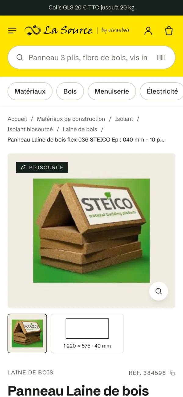
    The same product page on a phone.
  8. 08The basket

    Delivery, collection or quote

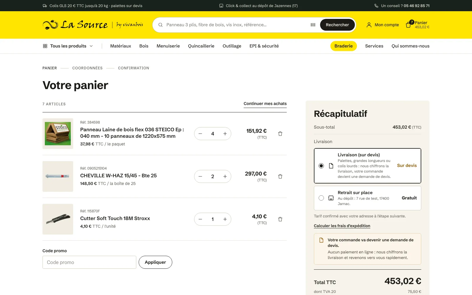
    A merchant does not ship a pallet like a parcel. The basket applies the depot’s rules: GLS parcels at €20 including VAT up to 20 kg in mainland France, a transport rate set per product or per category, free collection at the depot.

    When none of these applies, the order becomes a quote request: no online payment, the merchant prices the delivery and calls the customer back.

    Everywhere else, adding to the basket happens without leaving the page, with a confirmation and a mini basket that slides in from the side.

    The basket: product lines with their sales unit, then a summary offering delivery on quote or collection at the depot.
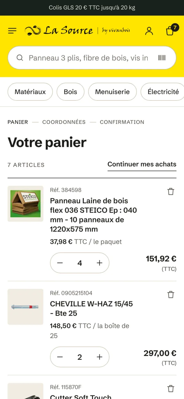
    The basket on a phone.
  9. 09Under the hood

    Lighter, and safer

    The store still runs on WordPress and WooCommerce: the merchant keeps its back office and its habits. I rebuilt the whole theme around a design system, and removed what was no longer used.

    • The JavaScript loaded on every page drops from 396 KB to 35 KB. The barcode scanner (88 KB) only loads when someone uses it.
    • The stylesheet drops from 577 KB to 190 KB: Bootstrap, Swiper and GSAP are gone.
    • Instant search results are escaped before display, and the theme’s source code is no longer published online.
    • Every product and category address stays the same.
  10. 10The result

    A trade counter, open online

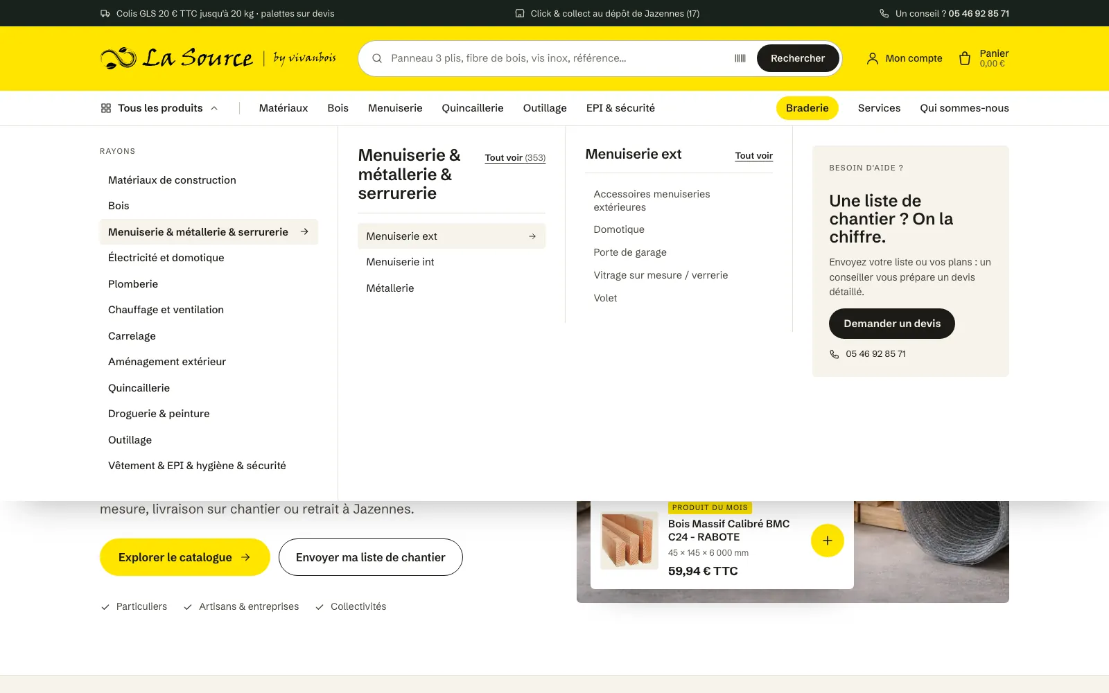
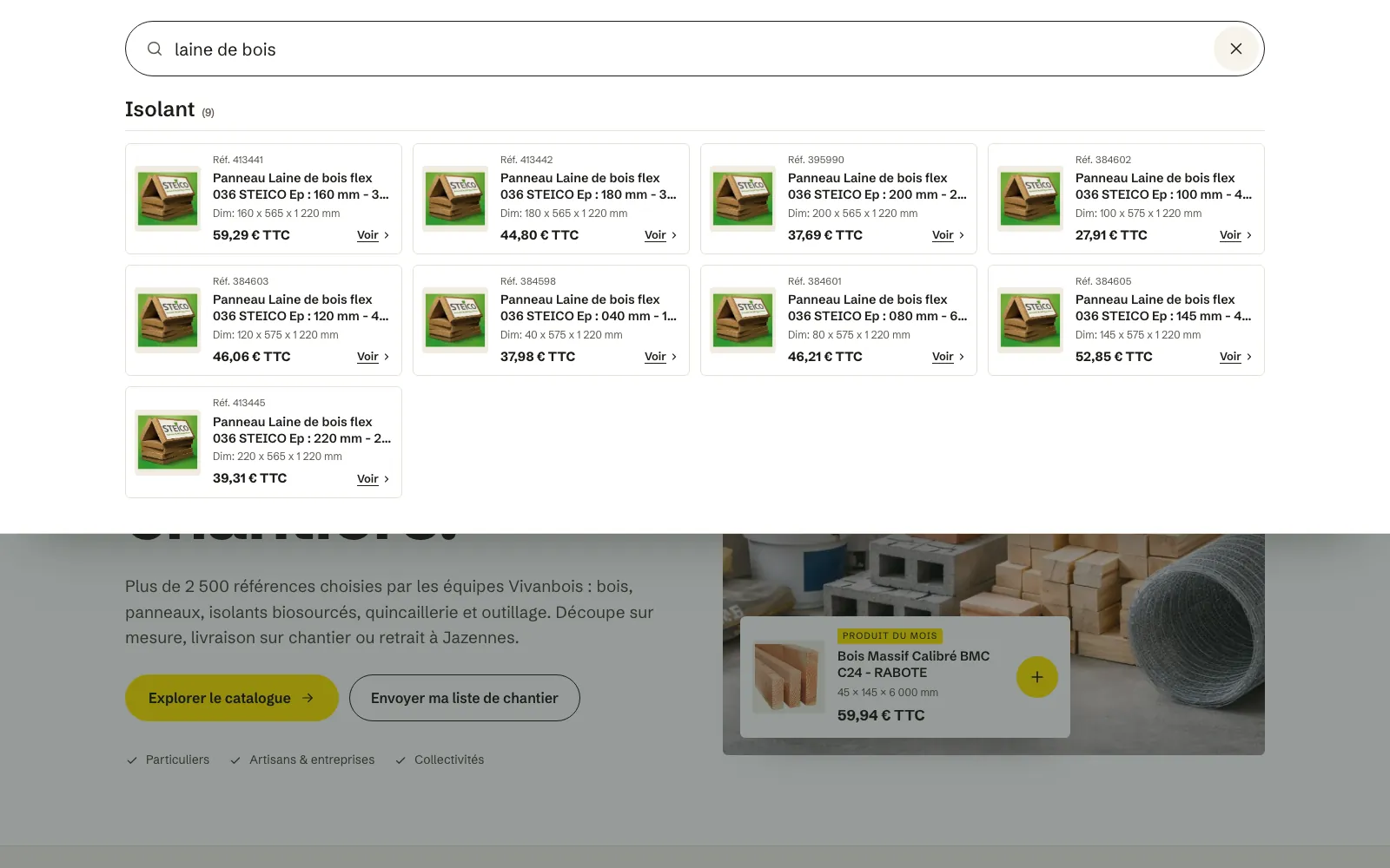
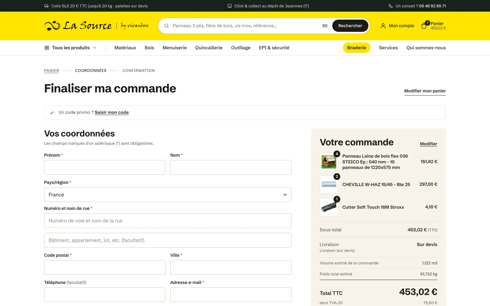
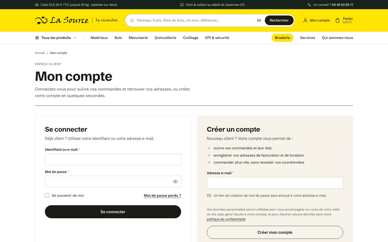
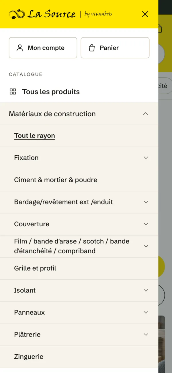
    From the home page to the order confirmation, every page speaks the same language, down to the customer account and the 404 page. The mega menu opens the twelve categories and their sub-categories, and search suggests products from the second letter typed, or from a barcode scanned with a phone.

    The mega menu: the twelve categories on the left, their sub-categories in the middle and a quote request box.
    Instant search: wood-fibre insulation boards found, with reference, dimensions and price including VAT.
    Checkout: contact details in two columns and the order summary on the right.
    My account: sign in and create an account side by side.
    The home page on a phone.
    The menu on a phone, with categories expanded.

Work

More projects

Contact

Drop me a line.

A project along the same lines?

Tell me about your business and what you expect from the site. I will reply with questions and a first estimate.

bonjour@kma.studio