Redesign & art direction2026

A.S. Velasca
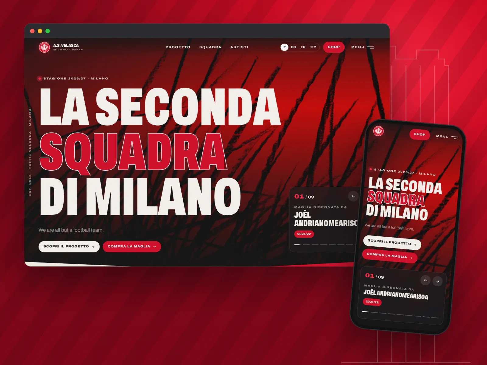
Preview of the A.S. Velasca project

A complete redesign, from art direction to code, for a club that calls itself “la seconda squadra di Milano”, the second team in Milan.

Context

A.S. Velasca was founded in 2015 at the foot of the Torre Velasca in Milan. It is a real club, playing in Terza Categoria, the lowest tier of Italian football, and an art project: every season an artist designs the shirt, and every match ticket is drawn by an artist, a player or a supporter. I built their website in 2019. It still worked, but it told the club’s story poorly: a red banner, a slideshow, white pages and little room for the artists.

What I did

I rebuilt everything, from art direction to code, while keeping what worked: the crest, the tool the club uses to publish, the PayPal shop, the four languages and every existing page address. The new site is organised around two ideas, the tower and the artists, with a shirt-lettering typeface, full-screen visuals and animations that add rhythm without getting in the way of reading.

Key points

  • 50×lighter: the home image drops from 6.2 MB to 120 KB
  • 4 languagesItalian, English, French and Chinese
  • 0content to re-enter: the club keeps its editing tool
In-depth case study

From the tower to the shirt, step by step.

  1. 01The club

    A football club and an art project

    The club was founded by five friends, somewhere between football and contemporary art: Marco De Girolamo, Karim Khideur, Loris Mandelli, Wolfgang Natlacen and Clément Tournus. Its name and crest come from the Torre Velasca, a mushroom-shaped tower from the 1950s that stands apart in Milan’s skyline.

    Every season, an artist designs the shirt: Régis Sénèque, Zevs, Jiang Li, Pascale Marthine Tayou, Francesca Belgiojoso, Kendell Geers, Joël Andrianomearisoa, and others since. Those works had to carry the site.

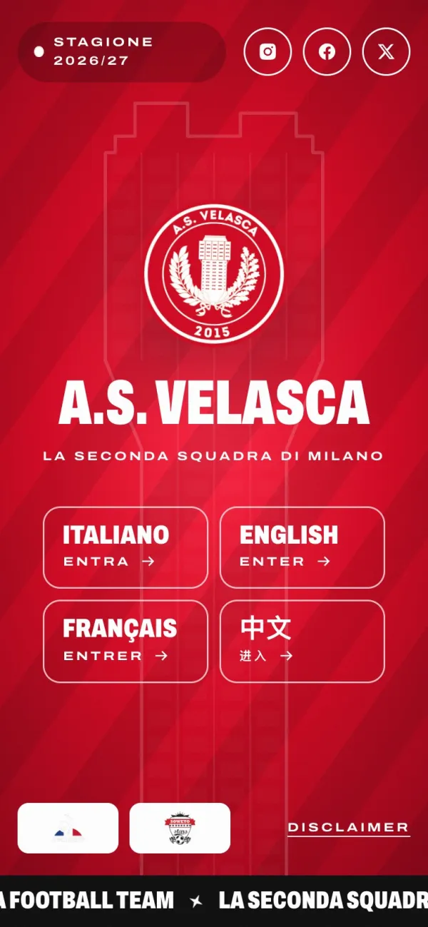
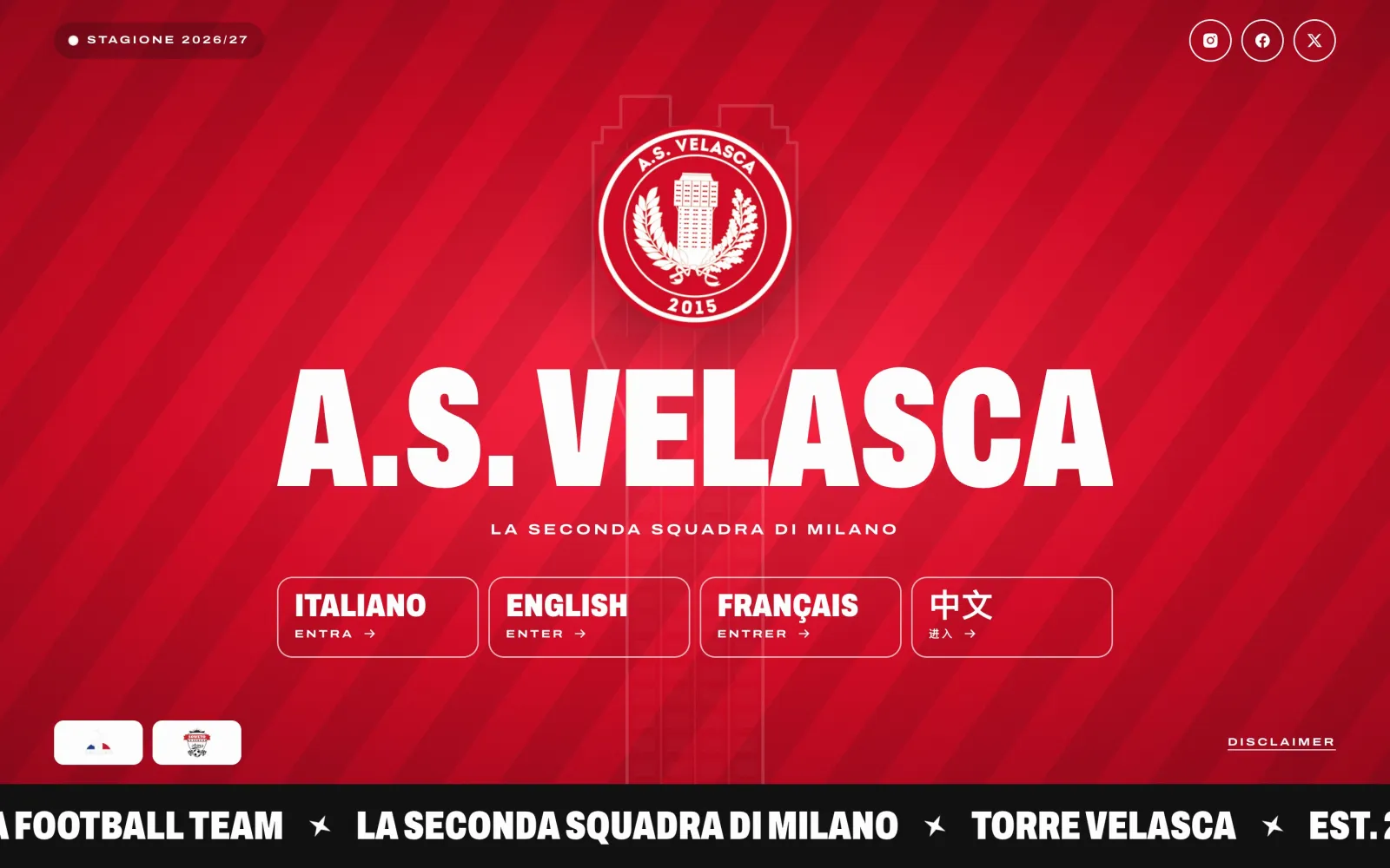
    A.S. Velasca entry screen: the crest, the club name and the language choice on a striped red background.
    The entry screen: picking a language, over shirt stripes.
  2. 02Starting point

    Keep what worked

    The 2019 site still held up, but it had aged: a crowded menu in a red banner, a full-screen slideshow with no staging, editorial pages on plain white.

    First, I listed what must not change. The club publishes its pages in a CMS (Cockpit): it keeps it, with nothing to re-enter. Page addresses stay the same in all four languages, so links shared over the years keep working. The shop still runs through the existing PayPal buttons.

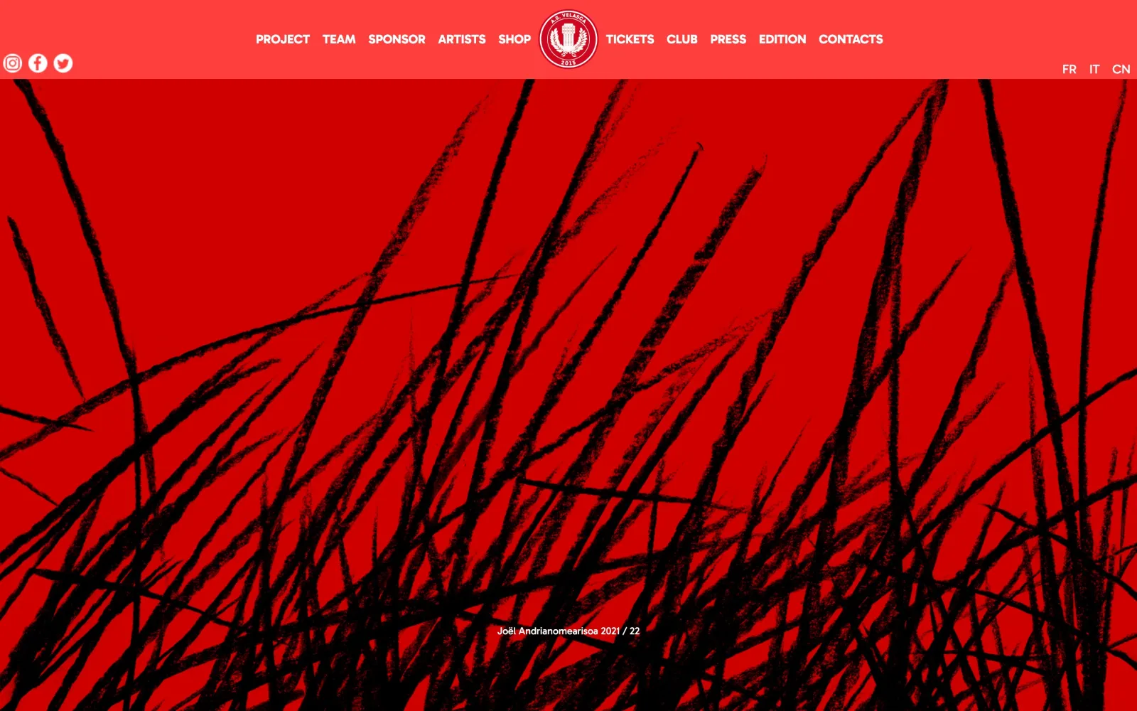
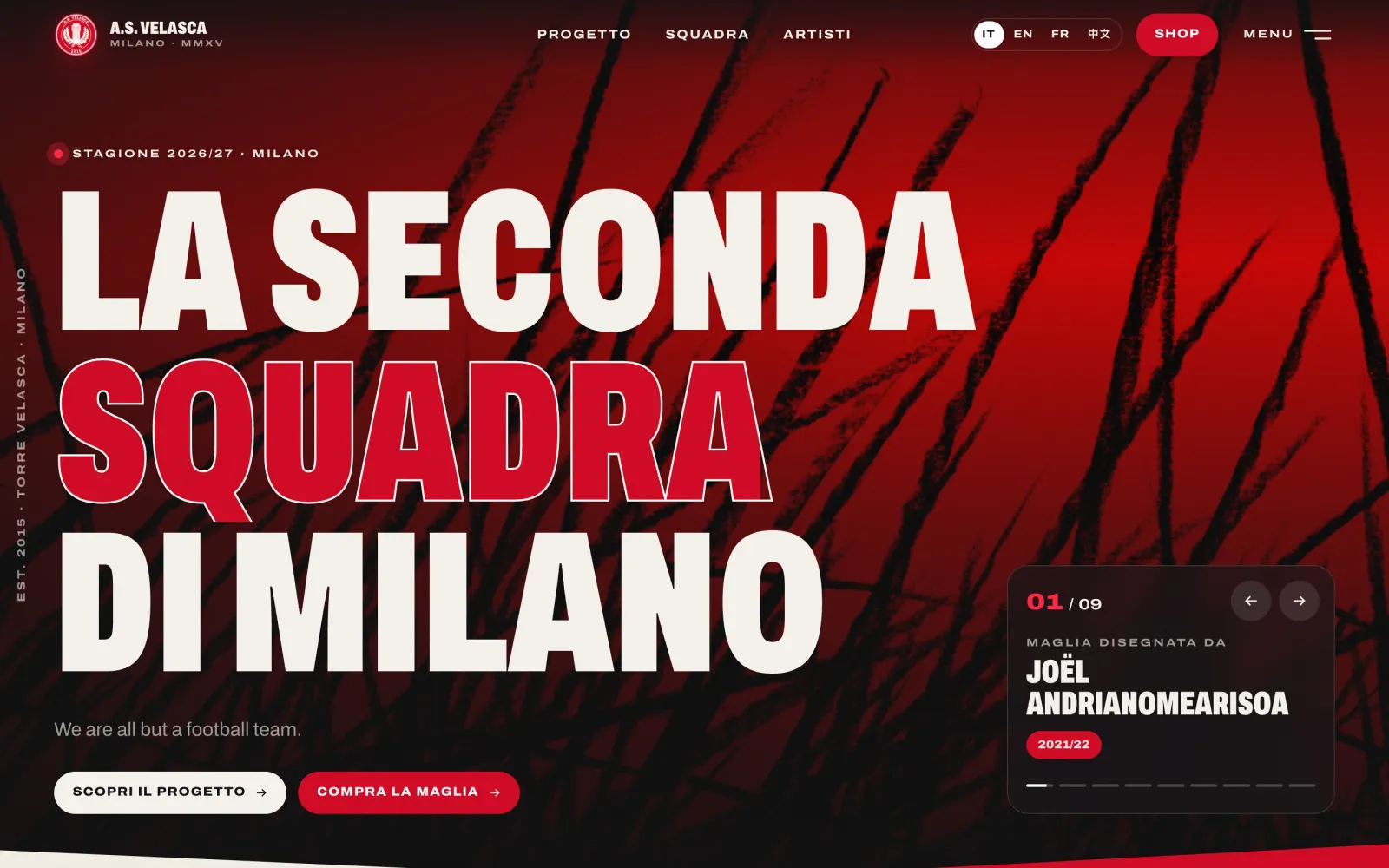
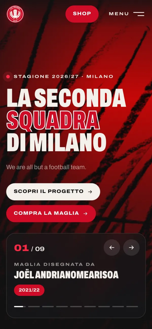
    Former home page: a red menu banner above a slideshow.New home page: “La seconda squadra di Milano” in large capitals over the full-screen shirt.
    The same home image, before and after: the 2021/22 shirt designed by Joël Andrianomearisoa.
  3. 03Research

    Start from what the club already makes

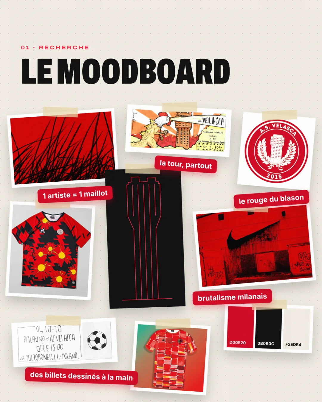
    I started by gathering what the club creates itself: the artist shirts, the hand-drawn match tickets, the crest, the match photos.

    Three things came out quickly. The tower shows up everywhere, even on the tickets. The crest’s red is enough, no need for more colours. And the artists belong up front, not on a secondary page.

    Moodboard: artist shirts, hand-drawn match tickets, the crest, a drawing of the tower and colour swatches, with handwritten notes.
  4. 04Typography

    A shirt-lettering typeface

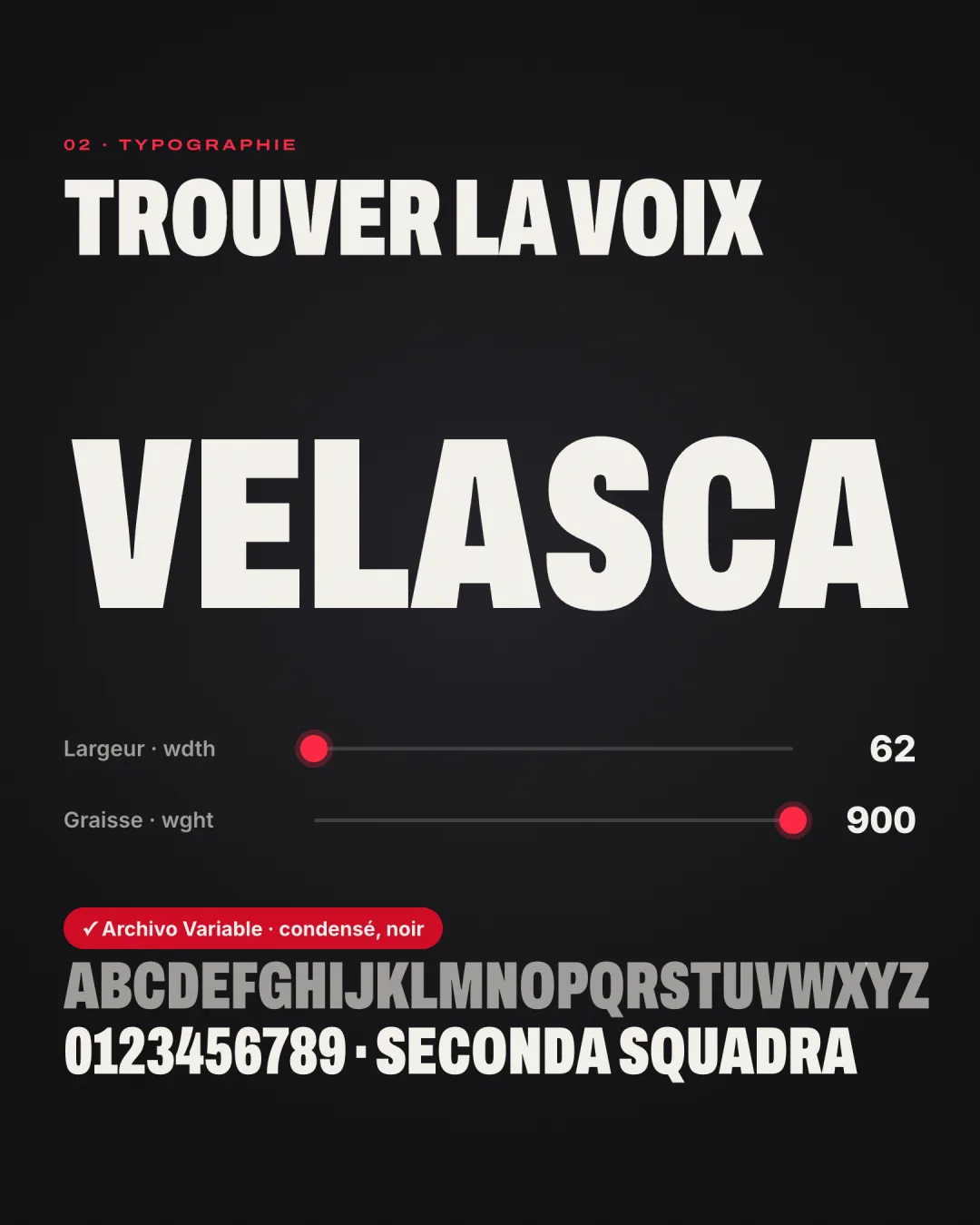
    I chose Archivo, a variable typeface with a width axis on top of weight. One file gives very tight, very black headlines, like shirt lettering, and small, wide, spaced-out labels.

    The font is served by the site itself: no call to Google’s servers, which avoids sending visitor data to Google and speeds up loading.

    The word “Velasca” set in Archivo, width 62 and weight 900, with the alphabet specimen.
  5. 05Logotype

    The crest stays as it is

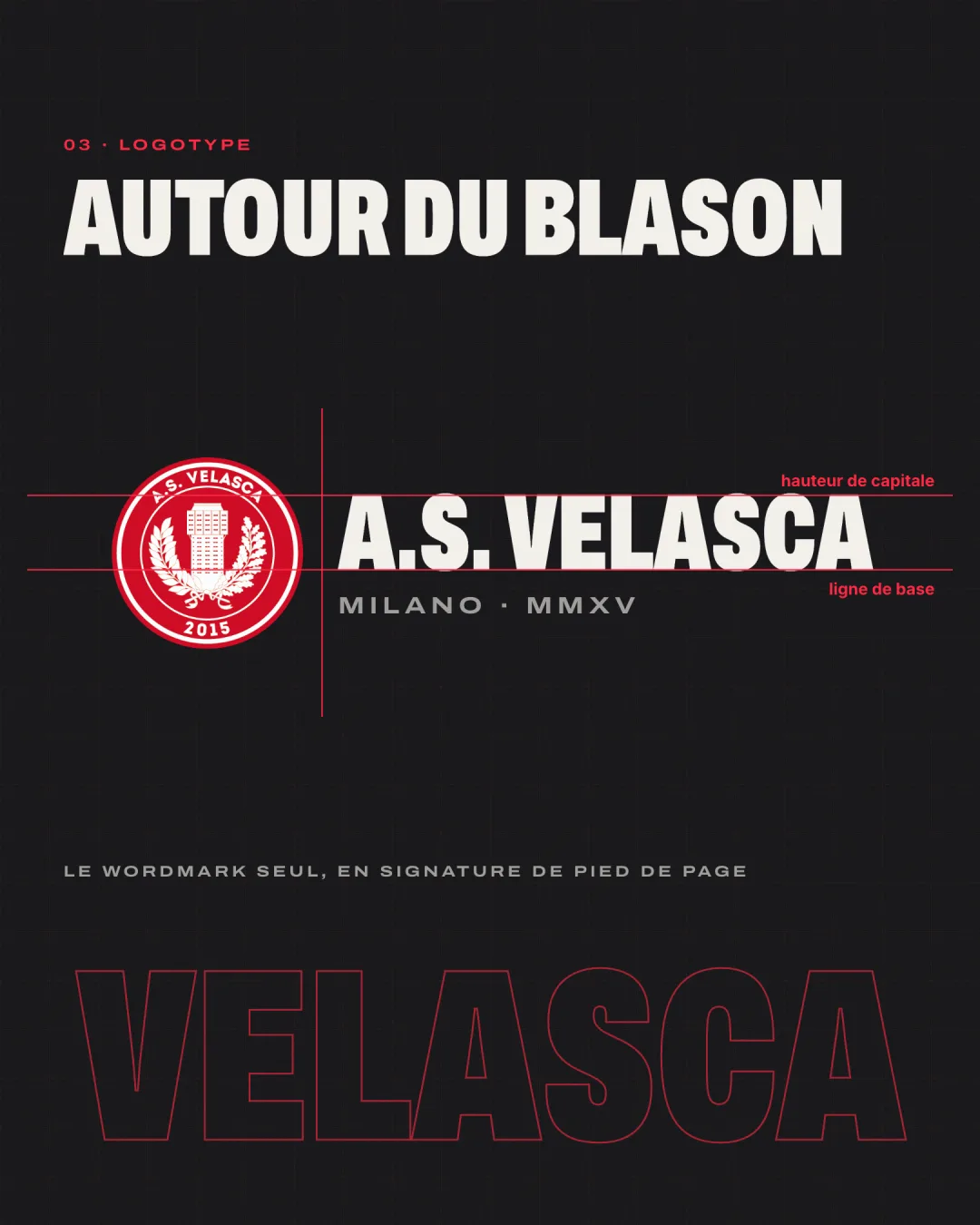
    The crest has been the club’s identity since 2015, so I left it untouched. I built around it: a horizontal logotype for the header, with the crest, “A.S. Velasca” in condensed capitals and “Milano · MMXV” in wide capitals, aligned on cap height and baseline.

    The word “Velasca” on its own, set very large, signs off the bottom of every page.

    Logotype construction: the crest on the left, “A.S. Velasca” and “Milano · MMXV” on the right, with construction lines.
  6. 06Pictogram

    The tower, floor by floor

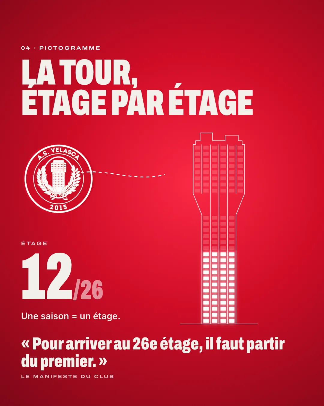
    The Torre Velasca has 26 floors, and the club’s manifesto puts it its own way: to reach the twenty-sixth floor, you have to start from the first.

    I redrew the tower as a line drawing, window by window, and made it a common thread. On the home page it lights up one floor per season played. For the 2026/27 season, that’s the twelfth.

    The crest’s tower redrawn as a line drawing, with twelve of its twenty-six floors lit.
  7. 07Colour

    Three colours, no more

    The red is sampled straight from the crest. It comes with an ink black for backgrounds and a paper off-white for reading pages.

    A diagonal stripe pattern, like on a shirt, returns on the entry screen and in transitions.

    • Rosso Velasca#D00520sampled from the crest
    • Inchiostro#0B0B0Cbackgrounds
    • Carta#F2EDE4reading pages
  8. 08Motion

    Rhythm that stays out of the way

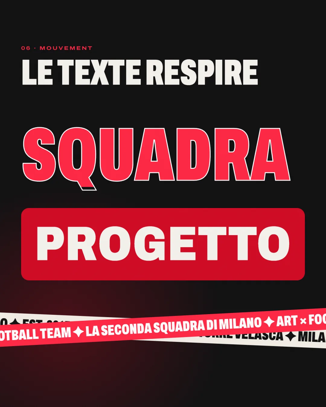
    The animations borrow from the stadium. Headlines tighten as they arrive, the word “squadra” floods with red, the home page shirts follow one another with a glowing wipe, the menu opens as a red disc and every page change goes through a sweep.

    Everything stops if visitors have asked their system to reduce motion.

    The word “Squadra” filled with red, “Progetto” on a red band and two crossing text ribbons.
  9. 09Under the hood

    Faster, and safer

    The club still publishes in the same place. On the site side, I rebuilt everything on a current stack (React 19, Vite), and each page only loads what it needs.

    • CMS images are resized on the fly: the home photo drops from 6.2 MB to 120 KB.
    • Content coming from the CMS is filtered before display: only the expected embeds and payment forms get through.
    • Dependencies are up to date: no known vulnerability at launch, down from 566 alerts before the redesign.
    • Every former address still works, in all four languages.
  10. 10The result

    A real club website

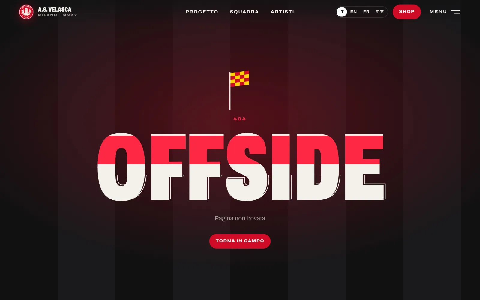
    From the entry screen to the shop, every page speaks the same language. Even the 404 page has its wink: “Offside”, with the linesman’s flag up.

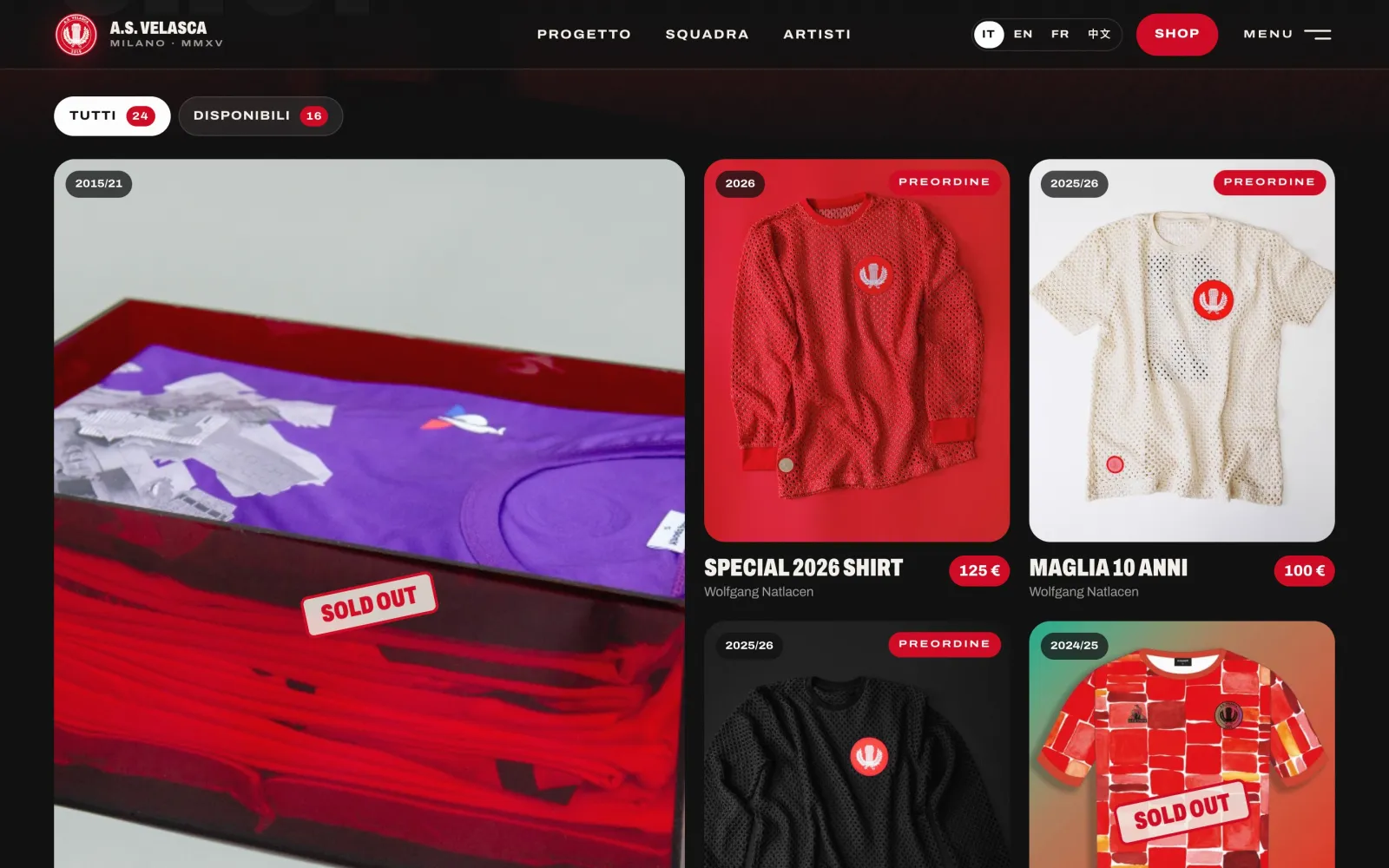
    The shop: artist shirts in a grid, with season and price.
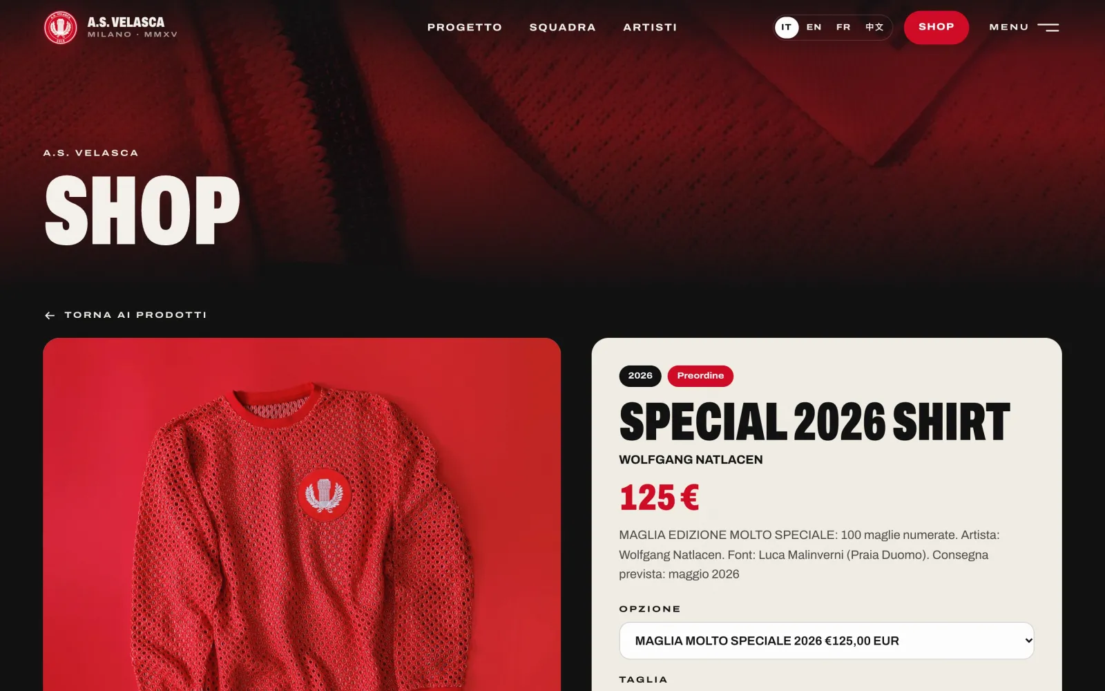
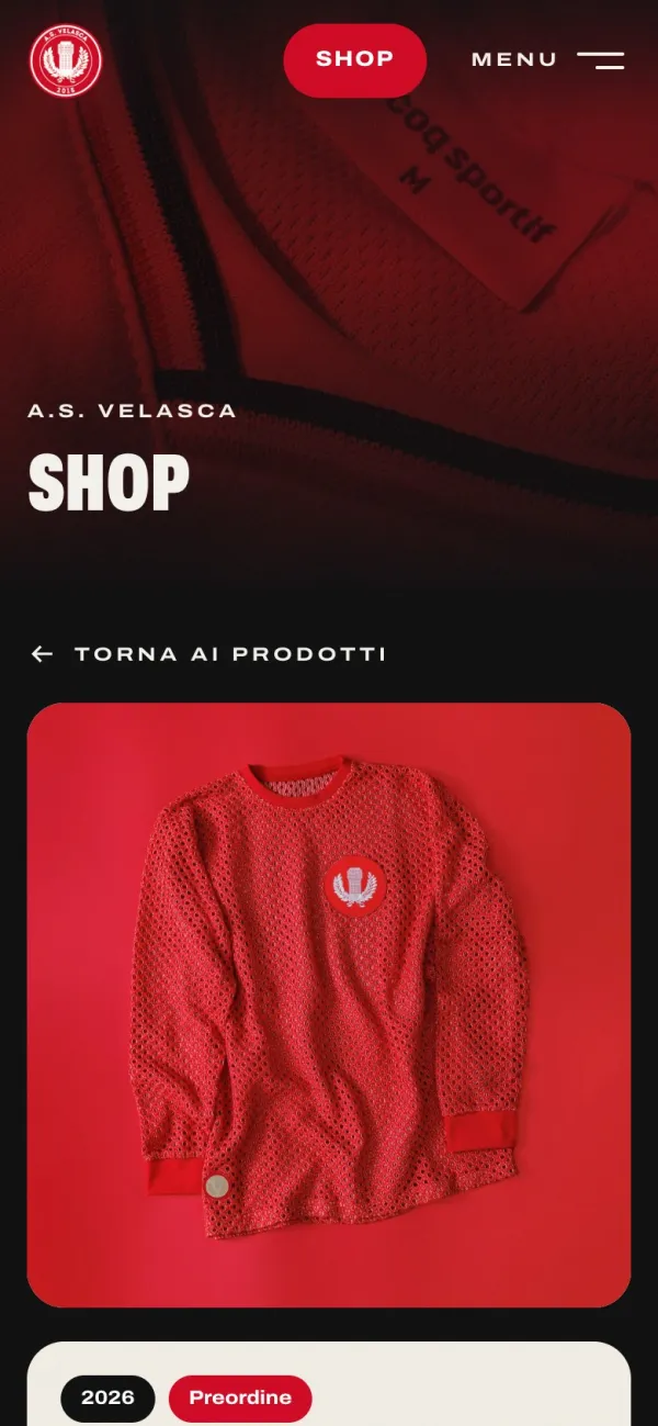
    Product page: the special 2026 shirt, with size selection.
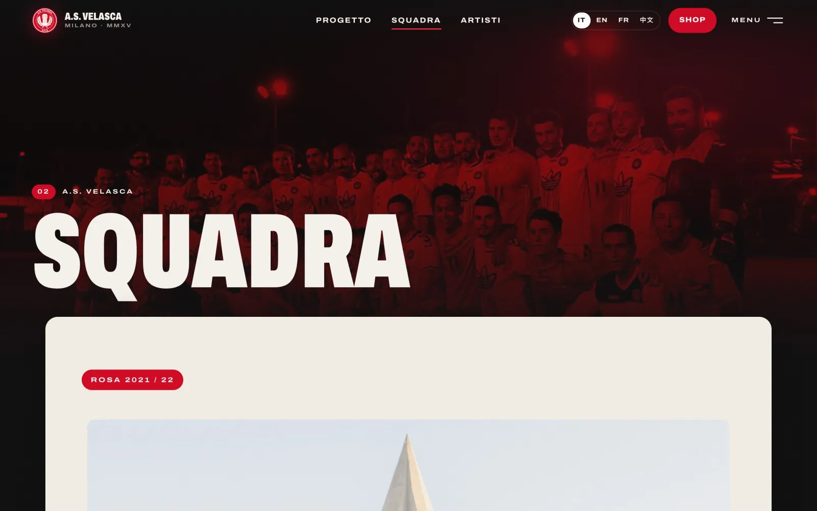
    The “Squadra” page: the title over a team photo, then the content on a paper-coloured sheet.
    The 404 page: “Offside”, with a linesman’s flag.
    The entry screen on a phone.
    The home page on a phone.
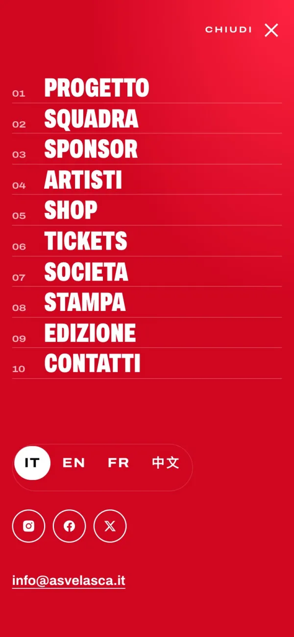
    The menu on a phone.
    A product page on a phone.

The film

The process, on screen.

The project’s presentation film, in motion design: research, typography, logotype, colour and result.

Work

More projects

Contact

Drop me a line.

A project along the same lines?

Tell me about your business and what you expect from the site. I will reply with questions and a first estimate.

bonjour@kma.studio